


A leaking cap, a slightly oily surface, and warehouse-to-shelf handling can expose weak packaging decisions fast. That is why edible oil bottle labels are not a simple design add-on. For food brands, they are a performance component that must protect compliance information, support shelf impact, and stay intact through filling, transport, retail display, and consumer use.
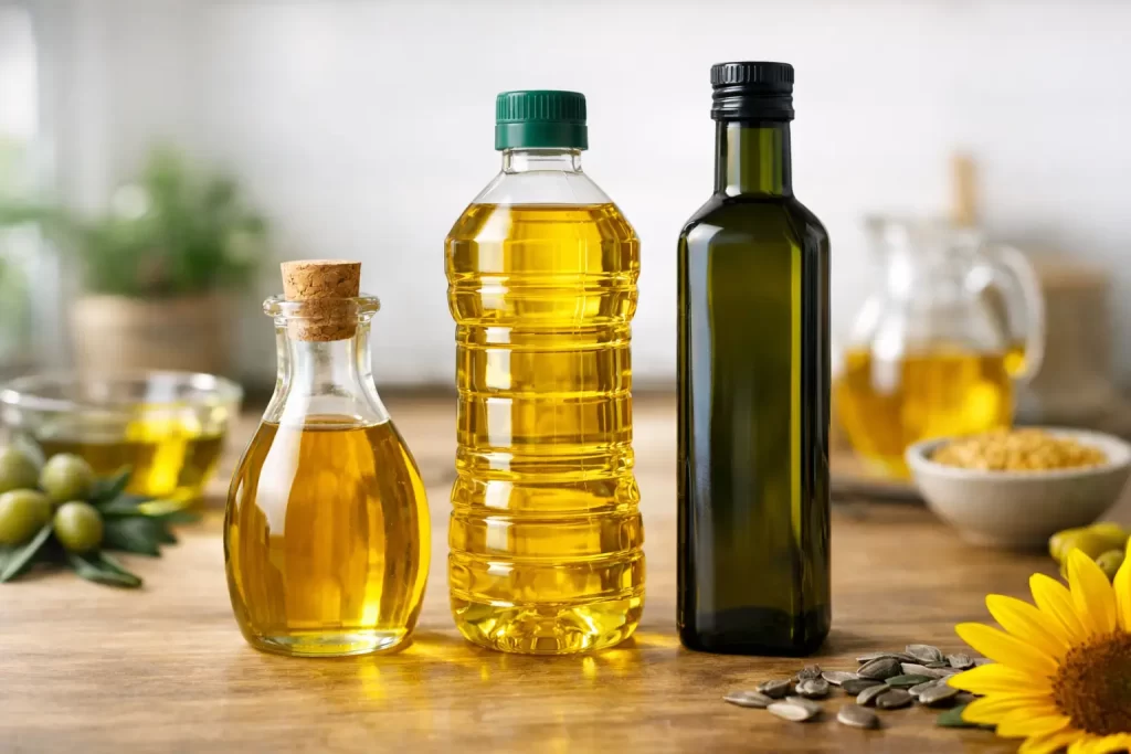
In edible oils, the label has to work harder than many buyers expect. Bottles may be PET, glass, or HDPE. Product ranges may include sunflower oil, mustard oil, olive oil, blended oils, or specialty variants. Some lines target value retail, while others depend on a premium look. The right label specification sits at the intersection of branding, regulatory clarity, adhesion performance, print quality, and production efficiency.
What edible oil bottle labels need to do
At a basic level, the label must identify the product and carry required information clearly. In practice, it also has to withstand oil contact, friction during transport, and changing storage conditions. If the label edge lifts, the print smears, or the adhesive fails on curved containers, the package loses both visual quality and commercial credibility.
For procurement teams and packaging managers, this creates a familiar challenge. A label that looks excellent in artwork approval may still underperform on the production line or in retail circulation. Material choice, adhesive behavior, print technology, and finish all matter. There is no single best construction for every edible oil bottle. The right answer depends on bottle substrate, label size, application speed, storage environment, and the brand’s price position.
Material selection for edible oil bottle labels
Paper labels can work for certain applications, especially where cost control is a primary concern and the supply chain is stable. They can also deliver a classic shelf look. The trade-off is resistance. Paper is generally more vulnerable to moisture, abrasion, and oil exposure than filmic constructions.
For higher durability, many edible oil bottle labels are produced using film materials such as polypropylene. Film labels offer better resistance to moisture, scuffing, and handling stress. They are especially useful for products that move through faster retail cycles, export logistics, or humid environments. If a brand wants a clean, premium finish with stronger durability, film often becomes the preferred route.
Clear labels can also be effective when the product itself supports visual merchandising. Golden or green-tinted oils often benefit from a no-label look, provided the print remains highly legible. That said, transparent constructions demand tighter control over adhesive appearance, print registration, and bottle surface cleanliness. Premium aesthetics are possible, but the execution standard has to be equally high.
Adhesives are not a background decision
In edible oil packaging, adhesive choice affects application performance as much as long-term appearance. Bottles may have slight surface contamination from filling environments, condensation in some conditions, or curved profiles that create stress on the label edge. A mismatch between adhesive and application conditions can result in lifting, bubbling, or poor initial tack.
This is where technical evaluation matters. Glass, PET, and HDPE do not behave the same way. Neither do smooth cylindrical bottles and shaped containers with grip features. A label that performs well on a flat sample may behave differently at full production speed. For high-volume lines, reliable adhesive performance is not just a packaging issue. It directly affects downtime, waste, and rework.
A dependable labeling partner will usually assess the full use case rather than recommending a generic stock construction. That approach is more valuable for edible oils because the product category introduces contact risks that can expose weak specifications quickly.
Print quality and compliance cannot compete with each other
Food packaging has to carry clear, accurate information. Product name, net quantity, ingredients, nutrition details, manufacturing and expiry information, batch coding areas, and market-specific compliance elements all need space. At the same time, edible oils are highly visual products sold in a crowded category where pack impact influences buying behavior.
The better approach is not to force a choice between compliance and branding. It is to engineer the label layout so both work together. Strong typographic hierarchy, controlled use of color, and proper spacing help maintain readability without weakening shelf presence. Premium brands may emphasize finish and visual restraint. Value-focused ranges may need bolder colors and clearer variant distinction for faster recognition.
Print capability matters here. Fine text, solid color consistency, and high registration quality all contribute to a better package. On edible oil bottle labels, poor print precision becomes obvious quickly because many designs include transparent sections, metallic accents, nutritional panels, and dense information blocks on relatively small containers.
Finishes that improve performance, not just appearance
Finishes are often discussed as decorative features, but in this category they can also support durability. A protective varnish or laminate can help resist abrasion and reduce the visual wear that happens when bottles are packed, shipped, and merchandised. This is particularly useful for products sold in high-touch retail formats.
Gloss finishes can intensify color and create stronger shelf impact. Matte finishes can support a more refined premium position. Textured effects or metallic embellishments may suit select product lines, especially in imported, specialty, or premium cooking oil segments. Still, the finish should match the commercial strategy. An overbuilt label on a cost-sensitive SKU may not deliver a worthwhile return.
There is also an operational consideration. Heavier constructions or complex embellishments may affect dispensing behavior on certain application lines. What looks strong in concept can add complexity in production if it is not specified carefully.
Bottle shape changes the labeling strategy
Not every bottle gives you the same margin for error. Straight-walled containers are generally easier to label consistently. Contoured or panelled bottles may require tighter material and adhesive matching. Small-format edible oil bottles can also create layout pressure because there is less surface area for mandatory information and branding.
Wraparound labels may offer more communication space and stronger visual continuity. Front-and-back label formats can create a cleaner premium presentation, especially on glass bottles. Shrink sleeve formats may be worth evaluating for highly shaped containers or when 360-degree branding is important. The right choice depends on the packaging line, cost model, and desired shelf presence.
For multi-SKU portfolios, standardization can improve procurement and production efficiency, but too much standardization can limit shelf differentiation. That balance matters. A family look across variants is useful, but each oil type should still be easy to identify at a glance.
Sustainability is becoming a packaging requirement
Brands reviewing edible oil bottle labels are also increasingly reviewing material efficiency and recyclability. This does not always mean moving to a single solution across the board. It means making better choices based on the bottle material, market expectations, and waste reduction goals.
Lighter constructions, recyclable-compatible label materials, and more efficient print planning can support sustainability objectives without compromising label performance. The practical question is whether the change works at production scale. A sustainable specification only adds value if it remains machine-compatible, durable, and visually consistent.
For many enterprise buyers, the most useful supplier conversation is no longer just about price per thousand labels. It is about total packaging performance, including waste reduction, changeover efficiency, print consistency, and how the label supports broader packaging goals.
Why supplier capability matters for edible oil bottle labels
A label for edible oils is a technical product. It has to be repeatable across batches, accurate in print, and reliable in application. That puts pressure on manufacturing controls, substrate sourcing, quality assurance, and production planning.
This is why converter capability matters as much as artwork quality. Brands need a partner that can align material choice, adhesive behavior, print method, and finishing requirements with actual operating conditions. Flexographic and digital production each have a role depending on volume, SKU variation, versioning needs, and lead-time expectations. The right manufacturing setup should support both quality and commercial practicality.
For regional and multi-market brands, consistency is especially important. If one production run looks different from the next, or one batch applies differently on the line, the issue quickly becomes larger than packaging aesthetics. It affects inventory control, fill-line efficiency, and brand trust. Companies such as Kimoha approach this category with that broader manufacturing view in mind, where labeling is treated as part of total packaging performance rather than a standalone printed item.
Making the right specification decision
The strongest edible oil bottle labels are rarely the cheapest option on paper, and they are not always the most elaborate either. They are the labels that fit the product, the bottle, the line speed, the market position, and the compliance environment without creating hidden operational costs.
That usually means testing before scaling. It means reviewing real use conditions, not just artwork proofs. And it means choosing a labeling specification that protects both brand presentation and production reliability.
When the label is built correctly, it does more than carry information. It helps the product move through the supply chain with confidence, hold its shelf presence, and represent the brand at the standard the market expects.